IMPROVISING THE
DBS DIGIBANK App
THE BRIEF
The objective of the project is to identify the possible improvements and makes necessary change to improve the user experience on the app:
Our Design Process
-
Knowing more about DBS
-
Understanding the functionality of the App
-
Running task analysis
-
Collecting public reviews
-
Conducting user interviews
-
Prototype & Usability Tests
-
Iterations
Finding out about DBS
To be able to find the right solution to whatever challenges that we discover later in the research, we will need to understand why the application was developed by DBS in the first place. Through the research, we have also found out that DBS has been winning awards for their mobile services.
Understanding the functionality of the App
Although we knew that DBS has been well recognised by the industry for their strength and ability to deliver innovative financial solutions to the consumers, it is inevitable for us to try out the application ourselves to know the functions available within the app and the performance it has delivered that garnered so much accolades from the different awards.
Running task analysis
A task analysis was conducted with a group of users to determine their frequency of use of the DBS DigiBank App and the top 5 tasks that they do with the app. The following graph is the result that we have gathered:

-
Transferring of funds
-
Checking account balances
-
Checking transactions
-
Paying their bills
-
Checking of due dates
Collecting public reviews
We understood that users do express their opinions online and on social media, therefore we looked into that area and started to collect as much information as we can. We managed to collect data from various public sources such as specific articles posted by DBS on their Facebook page, tweets, as well as app store reviews from Apple Store and Google Playstore. All these feedback collected were then analysed and referenced.
Conducting user interviews
Based on the information collected through the various task analysis and public source, we were able to formulate our interview questions in the following areas:
-
How frequent do they use online banking (desktop and/or mobile);
-
What do they do and how do they do it;
-
Past experiences of fund transfers, bills payment, new credit card applications,
requesting for waivers, etc. -
The last visit they made to a physical bank branch and for what reason
-
How they track their account balances and spending habits
Our goal was to gather as much behavioural data as we can about the users’ online banking experience. As the questions were general, and not necessarily DBS-specific, we also conducted interview with non-DBS online banking customers.
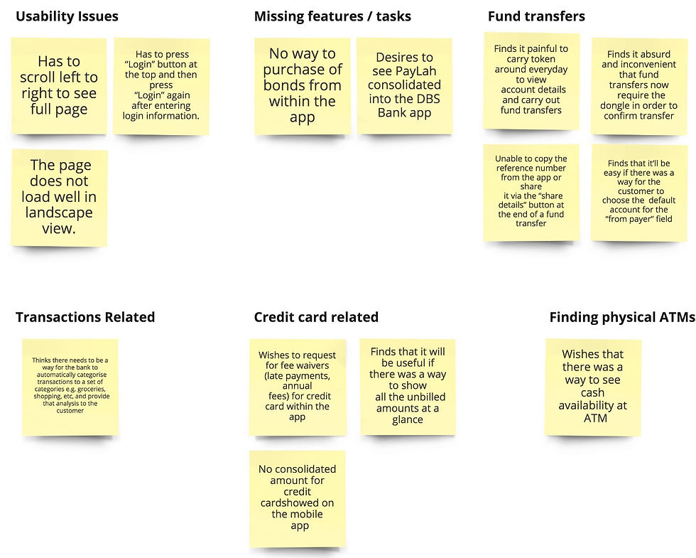
The result of our user interviews are presented in the affinity maps below:


Affinity mapping of our users’ behaviour in two areas: iBanking (online banking) and credit card
User personas for the typical online banking customer (left) and credit card owner (right)
Usability Test on the existing Application
We conducted a usability test on the current application and concluded the following findings:
-
Users preferred to have a simpler authentication processes (e.g. login, fund transfer, adding payee)
-
Users feel that the visibility of the credit card details can be improved (e.g. sometimes, users scroll past without realising they had gone past the date they are interested to find out about)
-
Users feel handicapped without their dongle when using certain services within the app
From a business perspective, It was more favourable to focus on Matthew due to the fact the he makes many transactions through the DBS Credit Cards and pays his bills on time. We will be focusing specifically in the area of making credit cards payments because we believed that his experience can be enhanced in terms of visual improvements and overall usability.
Process Flow Analysis
Matthew’s path to make payments for credit card bills
Currently, users are able to pay for their credit card bills via two pathways:


First pathway for both DBS and non-DBS cards via the hamburger menu
Second pathway for DBS cards only via the user’s dashboard
Matthew’s Journey to pay his credit card bills

Matthew’s Journey, pain points and potential areas of improvements
Prototyping
We started our rapid prototyping process with sketches on paper. Through some discussion with the team, we decided to take on 2 different prototypes, Prototype 01 and Prototype 02, with each one having a different design and interaction framework.
The reason for having Prototype 01 and Prototype 02 was because we wanted to determine which of the two prototypes works better for the users.


Prototype 01 with annotated comments
Prototype 02 with annotated comments
Running a usability test on the two prototypes
We ran a usability test to find out about the obstacles our users face when using either one of the prototypes. The key issues for Prototype 01 and Prototype 02 are documented below:
-
The placement for the “Make a payment” button in Prototype 01 (and the current mobile app) was not obvious enough to be spotted by users. We observed users going back to the home screen to find a button to make payment. We therefore needed to reconsider its placement. Following the principles of “mobile comfort zones”, we decided to place and pin the “make a payment” button at the bottom of the screen.
-
Users didn’t know they could change credit card once they arrive at the make payment page.
-
Lack of a visual cue on the “slide to pay” button resulted in users trying to slide up (instead of left as intended). We placed a arrow in a darker red of shade to indicate the direction they should slide in.
Combining the best from the 2 prototypes into one

Prototype 03 with annotated comments. This prototype combines the best from Prototype 01 and Prototype 02.
Next Steps
-
Further develop Vanessa’s personas. We have developed a concept, however, due to time constraints, we couldn’t add it to our prototype. The concept removes the dependency on the dongle when adding a payee; borrowing the idea of “share a contact”, a feature commonly found in phonebooks and other messaging app, a “secure link” is generated by the sender and sent to the recipient. Clicking the link will prompt the recipient to add the sender as a payee.
-
Categorisation of transactions. Users reported having insights into their spending will be helpful. Ideally, if the app can sort their spendings through the common labelling like, groceries, dining, entertainment and such, it will be great. Using machine learning, supervised classification can work great IF we have a dataset containing millions of transactions with categories assigned to them. If that is not available, we believe a combination of support vector machine and topic modelling might work. However, we would suggest using supervised classification for its accuracy.
-
Better customer support. Users highlighted that customer service officers were sometimes hard to reach. The current contact us and call back features within the app are only made available at the landing page. The moment the user logged in, the features will no longer be accessible. We hope to change this to make these features available even after the user has logged into their account and possibly to shorten the form for the call back feature.
Reflections
Working as a team requires every individual to understand and embrace one another’s shortcomings and strengths. Having a common goal is equally important. Although we had our different opinions, I am glad that we have listened to one and other and came to a better conclusion.
I am glad that our team worked well together and that couldn’t have happened without both Ridzwan and Ken. Thank you for the hard work that you guys have contributed to the project and the patience that both of you have given me. There is so much to learn from the both of you and I hope there will be another opportunity for us to work again.
Prototype Video
Assets are built in Sketch and developed in Flinto.
